CASE STUDY

Bringing Swarmies back on-platform with email notifications

OVERVIEW
I designed the notifications and emails to retain and re-engage users for our community of founders and builders.
TIMELINE
July – Sept 2021
TOOLS
Figma
THE PROBLEM

How might we bring users back to Swarm?

Swarm is a trusted community of founders and builders who collaborate on freelance projects. It started off as a forum with questions called swarms answered by responses called discussions.
Previously, our design team used Convertkit to write emails about new swarms every week. As more users joined the platform, we decided to design a custom email that would automatically send and trigger users to return to Swarm.
After gathering context from my manager and teammates, I set out to design three kinds of notifications: New Swarms, Mentions, and Followed Swarms.
NEW SWARMS

How might we show users new content?

First, we created designs to notify users about new questions asked on-platform. I explored various colors, hierarchies, headers, and layouts, particularly the banner design.
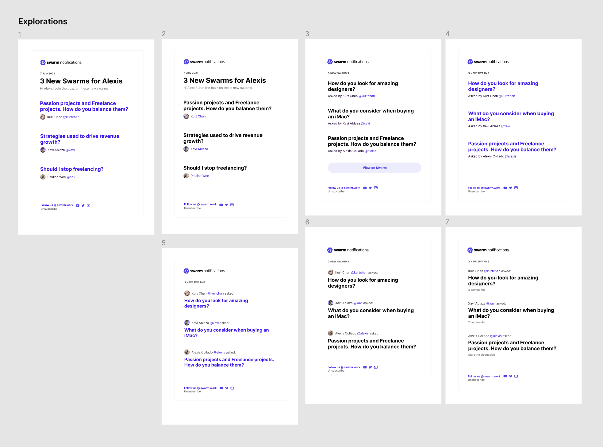
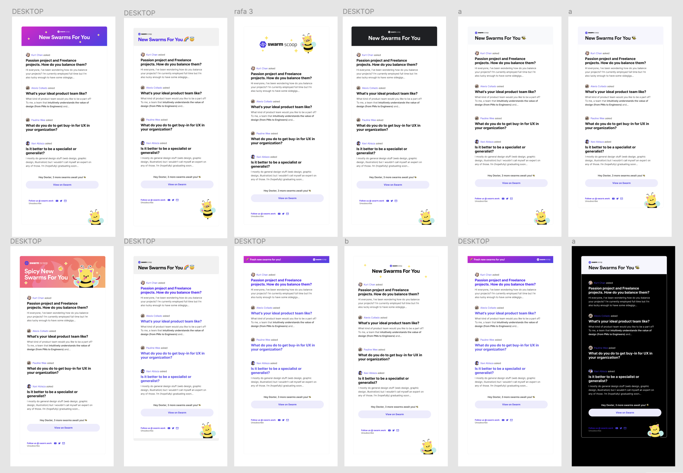
After receiving feedback in design reviews, I decided on a simple layout that would direct users to the central Call to Action ("View on Swarm") and a banner that would adapt to both light and dark mode in emails.
I also called users by name, added our little Catbee mascot, and highlighted the profile photos of Swarm authors in order to make the email feel more human and friendly.
MENTIONS
How might we let users know they were mentioned in a discussion?
After designing the New Swarms emails, I followed a similar layout and design to keep the Mentions notifications consistent. These emails would go out whenever you were mentioned in a discussion.
The copy was structured with a hook (You were mentioned in this swarm!), a line (details on who mentioned you, where, and why), and a sinker (CTA: View on Swarm.)
FOLLOWED SWARMS 
How might we update users about swarms they previously engaged with?
To reel users back to the platform, we also decided to send updates about swarms they had previously engaged with and thus auto-followed.
We did this under the assumption that these questions were relevant to them before, they'd be interested in subsequent responses.
AND THEY'RE SHIPPED!
Now, these notifications go out to thousands of Swarmies every week! 🥳
They bring users back to our exclusive community platform, where they can ask and answer all kinds of questions about tech, design, product, and foundership, as well as collaborate for high-value freelance projects under Bzzaar.
TAKEAWAYS
A lot more go into email nudges than I had initially thought. 💌
Aside from designing the emails themselves for desktop, mobile, and dark mode, I also had to think about the subject lines and subtitles, the frequency and schedule of the nudges for a global user base, and what would compel a user to actually go to Swarm.
A few specific takeaways from the experience:

01

Visual hierarchy is extremely important.

If everything is important, nothing is important. Shrinking down unimportant information allows users to focus on what's most important.

02

Direct eyes to the Call to Action

The most important button in all our emails was "View on Swarm". All the other content in the page was designed for the goal of pushing people to click that button.

03

Aesthetics make the difference

Tiny touches like friendly copy, good spacing, profile pictures, and hints of our mascot and brand color encourage the user to actually read through the email.
In the future, I'd want to improve on this system by doing more user research and usability testing, as well as iterating the design based on data about user retention.
I'd also love to try A/B tests to see whether changes in the subject copy (e.g. citing a specific new swarm each time rather than "New Swarms for You") would lead to a higher open and click rates.
Thanks to the team at Swarm for helping me design, review, and ship these emails! 🐝
Swarm has come a long way since these notifications :) More case studies soon!